A visual arts enrichment project organized by the Educational Resource Centre
Friday, May 27, 2011
Friday, May 20, 2011
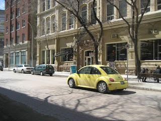
Car scene - Bryn from Springfield Heights
I like how the most cars are new, and one is an older model. This shows state of being. I also like that I was able to combine motion as well.
Light and dark - Gavin from Springfield Heights
I captured motion here with my classmates walking, but I like how the picture is divided into light and dark. The dark side of the bar matches the building and the light side matches the sky.
Wednesday, May 18, 2011
Cello in the Park - Kayla from Lord Wolseley
I was attracted to this picture because it was unique and I love unique things. I wanted the cello player to come out clean and clear(in focus) but it turned out blurry and I thought it looked cool and I fell in love with it.
Yellow Bumble Bug - Tessa from Ecole regent Park
The Block of Wood - Amy from Ecole Regent Park
1. I liked how the back was blurry.
2. There was a diagonal in the picture.
3. It focussed on one thing and the background is faded out.
4. I went on the ground.
5. The block of wood.
Walking on Sunshine - Drew from Prince Edward School
What attracted you to the image? I like how both of the colors clash together
What circuit theme did you chose for your final image? Motion
What category of composition would your photograph fall under? I do not know?What type of technique did you use? I used an angle
Give your image an artistic title: “walking on sunshine”
Old Versus New - Emily from Arthur Day Middle School
I chose this picture because of the old tree and the new, young tree, the dirt against the green grass, and the old building with the younger trees. This picture is part of literal translation. The technique I used is lifecycle. My title is old versus new.
Paralized Wings - Reanna from Bird's Hill School
Hi I'm Reanna from Bird's Hill School and here's my chosen photo from the VIsual Arts Photography Workshop.
I also wanted to let you know that I had a great time and it really inspired me to take more photos.
I chose this picture of a butterfly that was sitting dormant on a tree. The clear front view of the image and being able to see the face of the insect is the reason I chose this as my final picture.I believe the circut theme means the route that we took, and the way that our group went was the red diamond route.
Being not sure wich category this would fall under I think it would be in the state of being.
The technique I used for taking the picture was the ISO function on my camera.
I called my photo "Paralized Wings".
I hope you like it.
Ryan from Emerson School
The mirror on the street attracted me and I thought it would be a nice photo. The literal translation is the circuit theme. The rule of thirds is the category of composition. The techique I used was to focus on the mirror and try to capture the reflection and the surrounding buildings. The name I choose for my image is 'Reflection'.
The What's Up Wall - Ryan from Emerson School
The thing that attracted me to this image was all the bright colors in the posters. The circuit theme is literal translation. The category of composition is a full story shot. The technique I used was to zoom in and ensure I got all of the wall. I call this shot 'The What's Up Wall?'
Mysterious metal - Sheetal from Salisbury Morse Place School
I was attracted to the image because to line leads your eyes to the truck. The picture is in the theme of motion. I put the camera close to the metal line and made the camera focus on the close objects to make the truck in the distance out of focus.
Lucky doggie - James from Salisbury Morse Place School
The picture is a lucky accident because the dog looked right at the camera. The theme is movement or motion. I was just snapping random pictures and got lucky.
Spiralling stairs - Jaydon from Salisbury Morse Place School
I like the perspective of the feet in the photo because it shows that the stairs are very high up. The picture shows a spiral pattern implies a spiral motion. The picture could have been done without the feet, but it gives the picture a neat effect.
Buildings - Vanessa from Salisbury Morse Place
What attracted me to this picture was the angled lines. It illustrates "state of being". My technique was mostly moving around to get the best angle.
The Musicians - Alyssa from Sun Valley School
I used lots of techniques I mostly used my first technique which was to focus on the object I was taking the photo of. What attracted me to this image was if it was interesting I also used motion a lot too. My favorite photograph would fall under motion. Title of the photo: The Musicians.
Subscribe to:
Comments (Atom)


